Natural vs Satobi
After sharing my previous days playfulness with the new Satobi Custom Image profile (with my own quirky twist of course), a couple of interested users wanted to know how Satobi compares with Pentax’s stock image profile ‘Natural’. So this morning’s walk provided an opportunity to snap and share those differences.
For these series I did not tinker with the Satobi profile (like I did previously) but I did choose ‘Daylight’ as the White Balance option throughout. All the Jpgs here have been lightly retouched in Lightroom (in sync with their adjacent image counterparts of course), this just to help with ease of reviewing the images and better seeing the differences here on the web. Masterpieces they are not but hopefully they should provide something noteworthy.
Please note, if viewing on a desktop computer you may have to zoom out a little for some of the vertical shots, for mobile it should be fine. Dragging the slider from right to left reveals Satobi Profile.

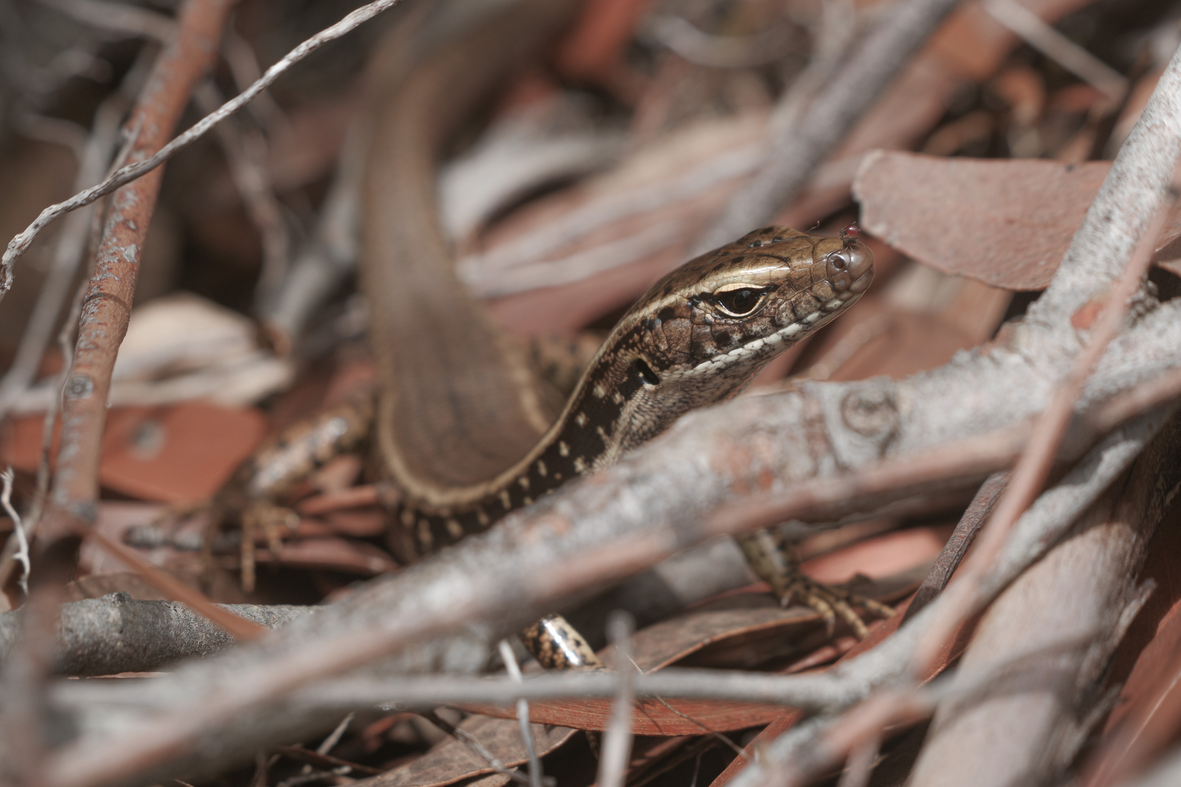
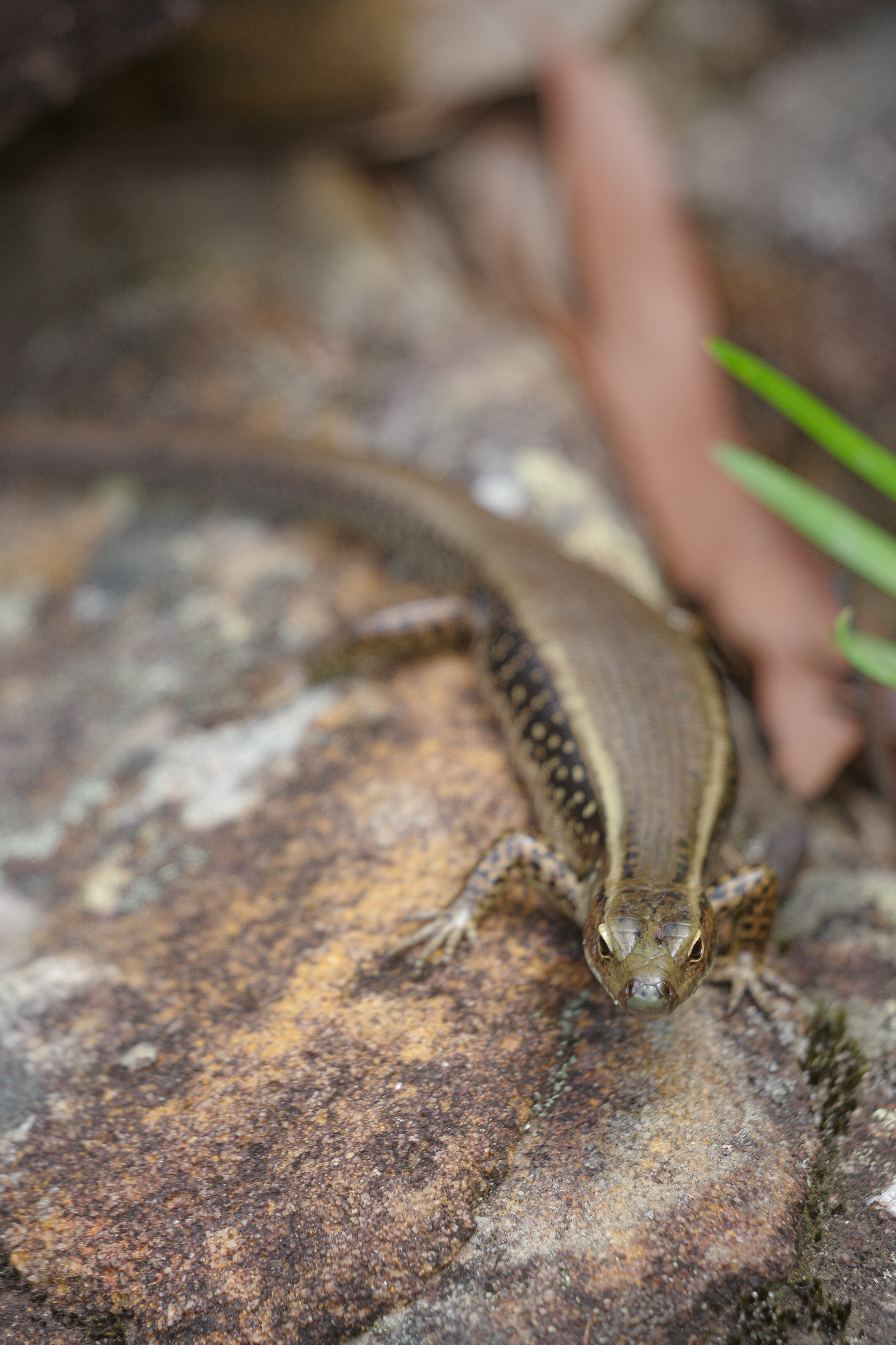
I really like how Satobi subdues the yellows and greens here, it reminds me a little of Fuji’s ‘Classic Chrome’. The lizard has a metallic shine that I really prefer over the Natural profile here.
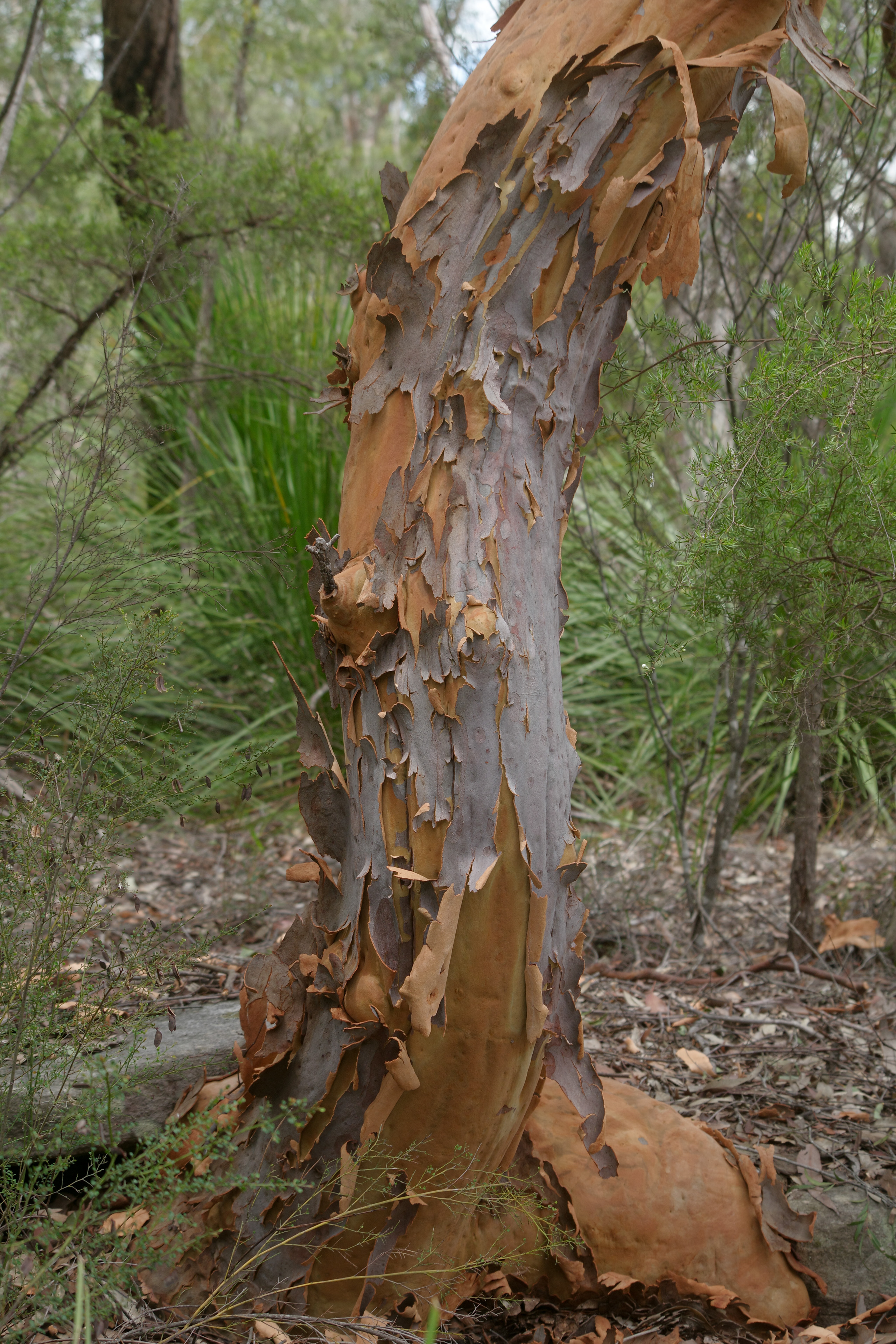
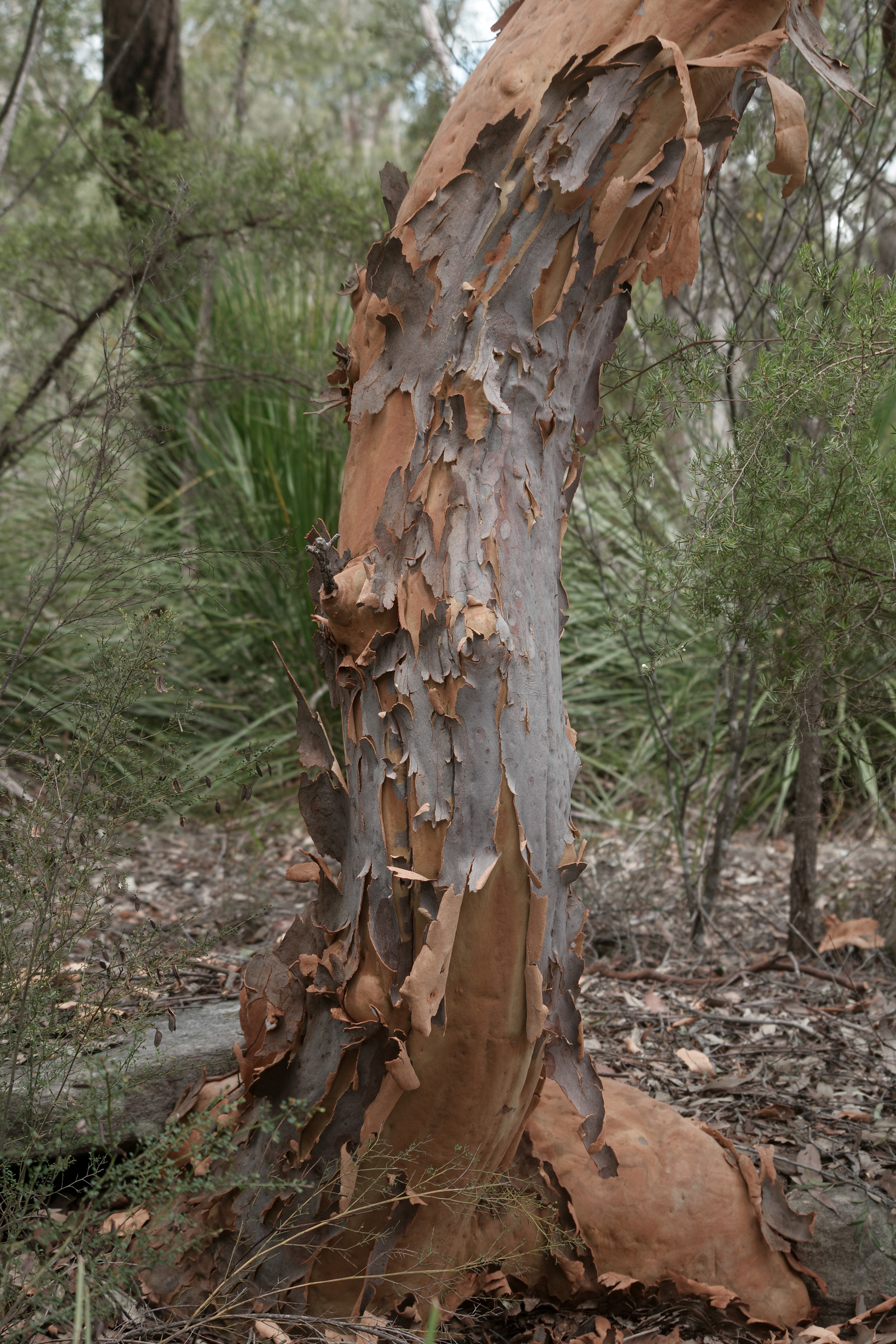
I like what Satobi is doing with the greens, it’s making them take a back seat a little and allowing the silver bark to take primary attention better. Those ‘chromatic’ vibes are really pushing through here and assist with that silver grey bark goodness.
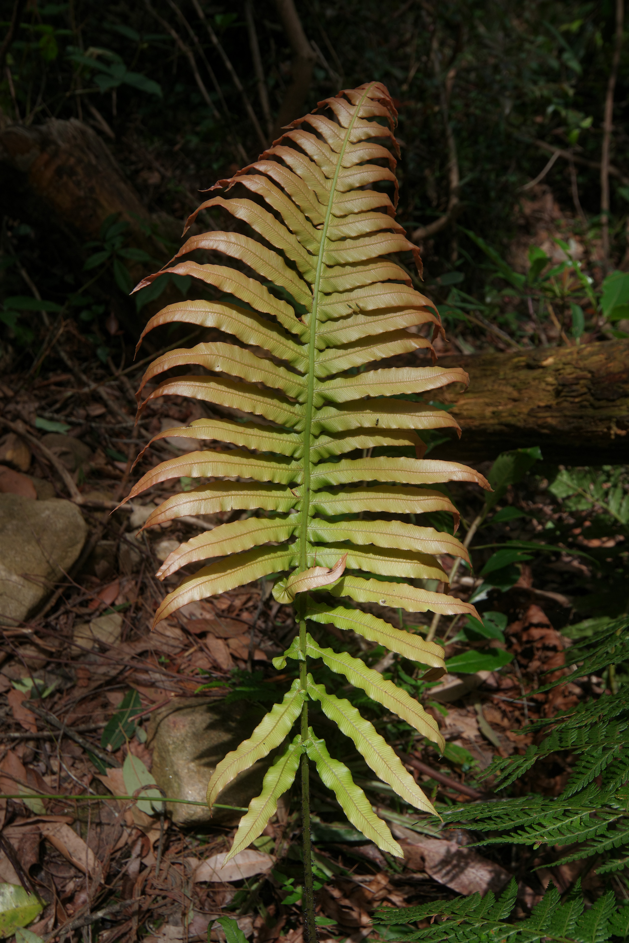
A reduction in saturation or vibrancy seems to be a bit trend for Satobi. It's a welcome change and allows for some of the other subtle colours to stand out a little bit more and take that center stage. There's also a warmth within that muted vibe that I really like.
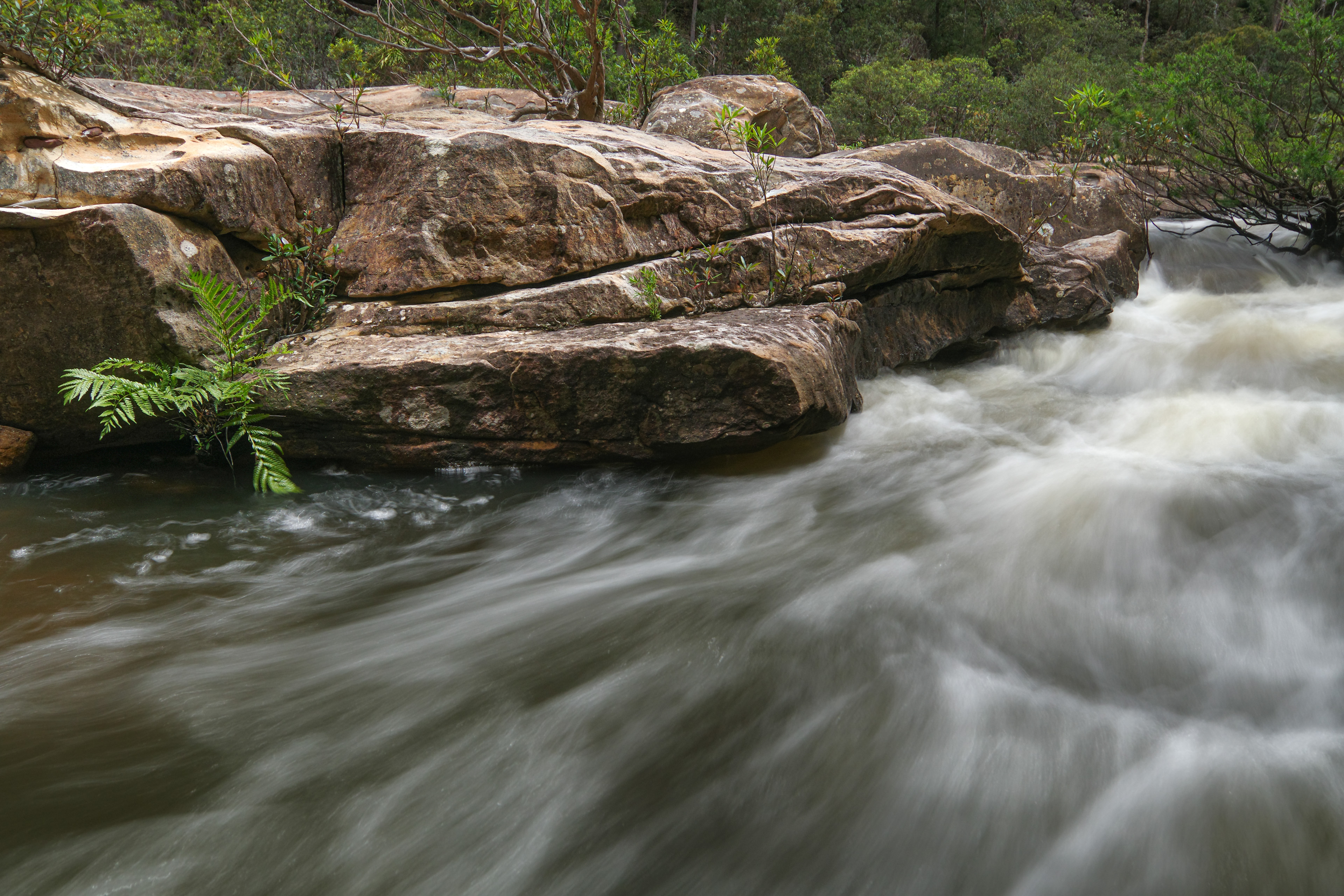
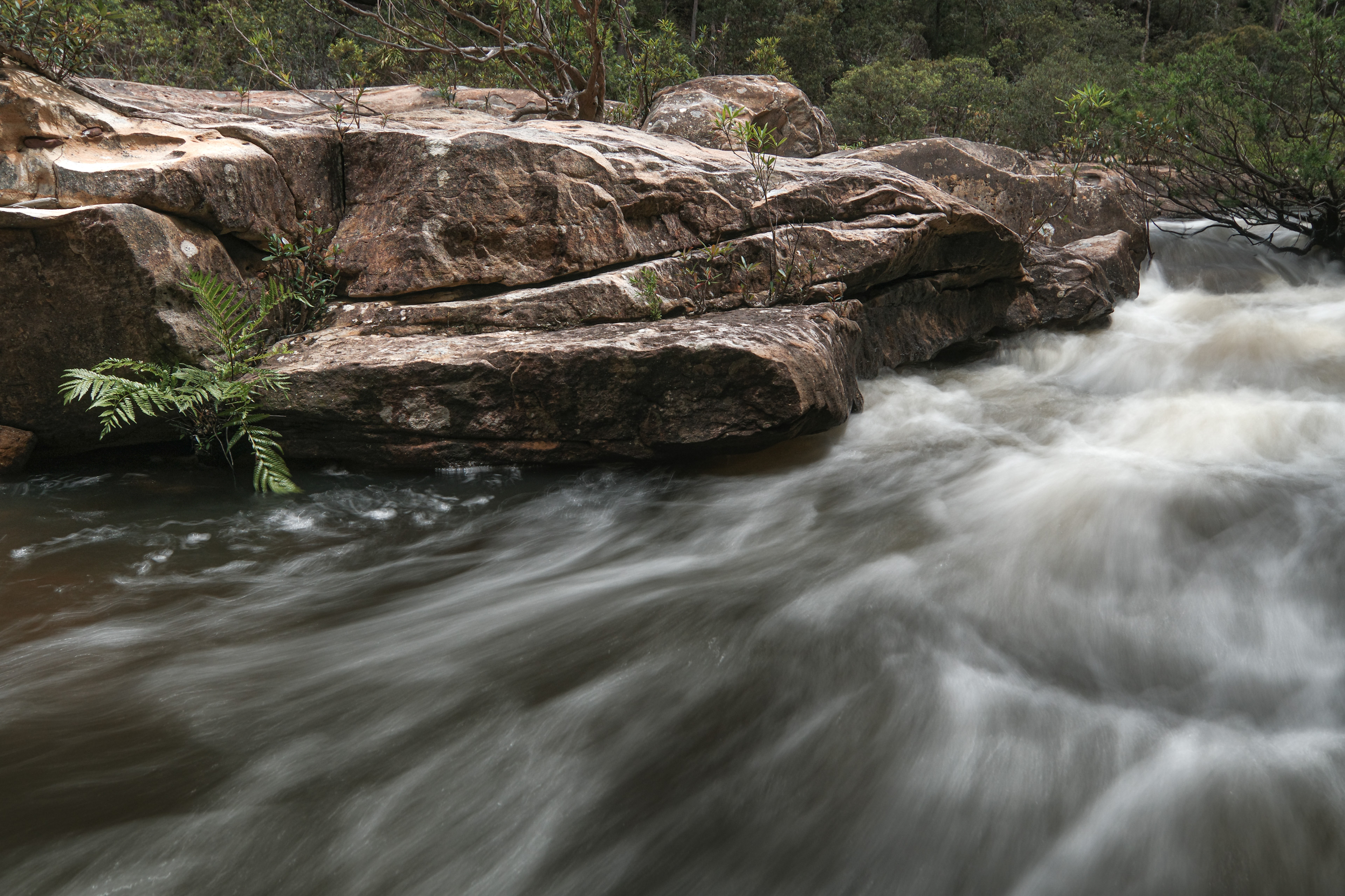
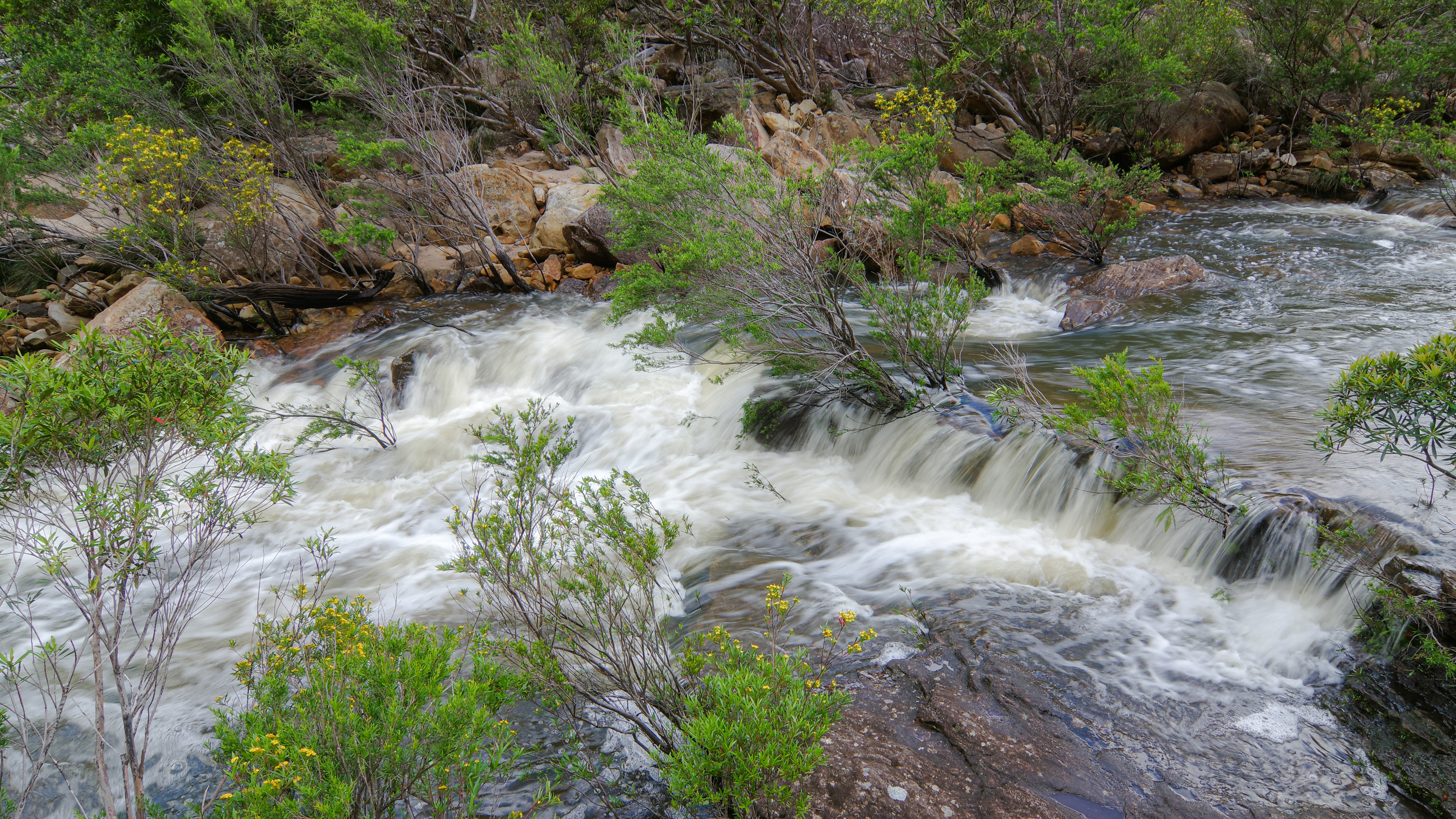

I feel the shift away from the greens here let’s the user appreciate the light and lines of the water more easily and perhaps also the texture of the rocks. is Satobi more natural than Natural?
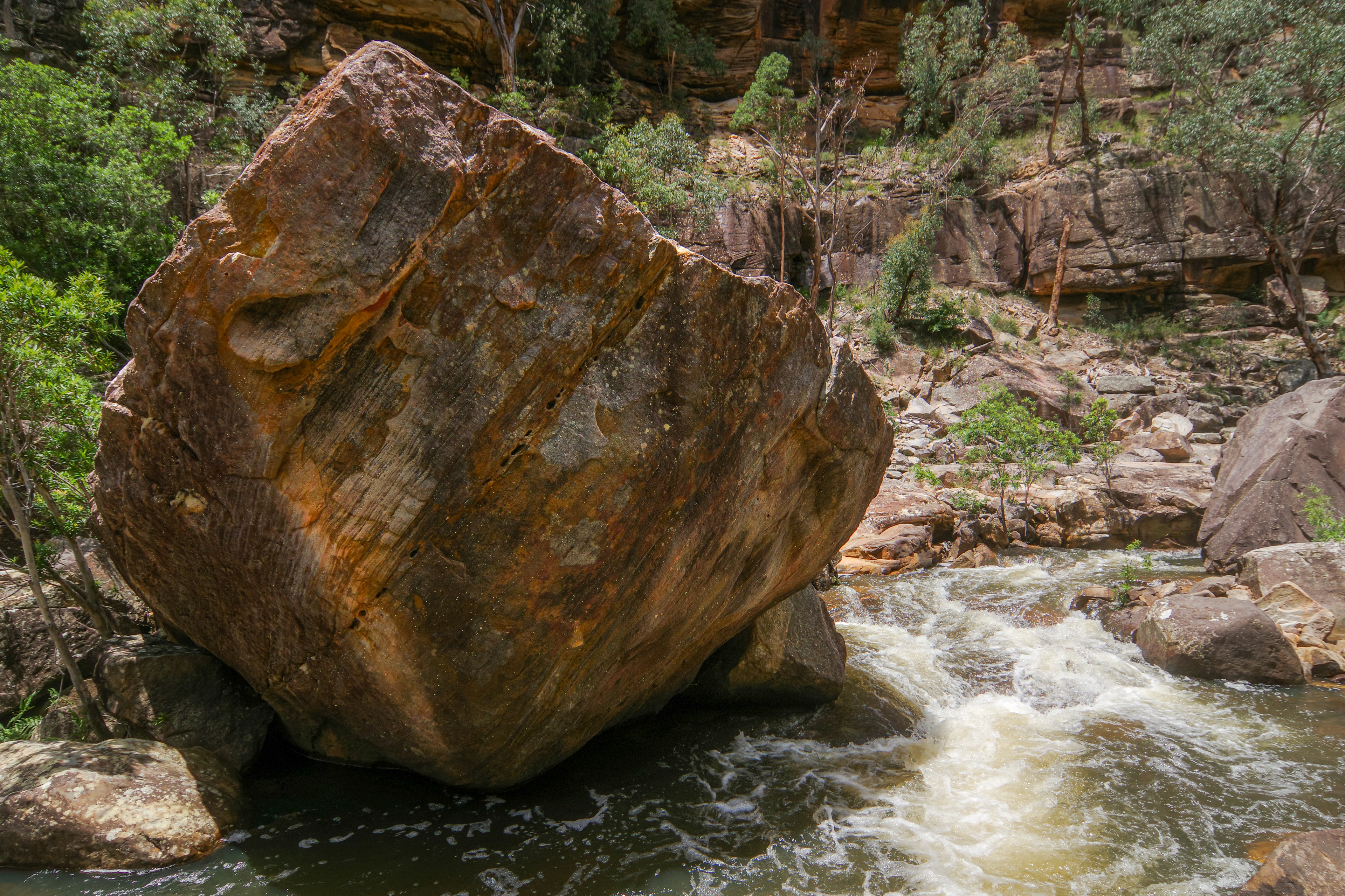
And there you have it.
Australia can be pretty extreme at times for those greens and oranges and this was just a comparison when using the cameras basic ‘Natural’ Custom Image profile. I find ‘Landscape’ or ‘Vibrant’ Custom Image profiles to being quite over the top for a lot of Aussie nature scenes. Of course it depends, Uluru can reward you well when choosing those vibrant saturated options.
Overall though I really did feel Satobi offers something much needed to round out the profile range for Pentax. I look forward to it being ported across to my K-1 (hopefully in the not too distant future).
Well I hoped you enjoyed this ‘Natural vs Satobi’ in nature episode, now I want to see how it looks in an urban setting :-)